
First steps in Metabase
Build your first chart in eight clicks, no code. This walks you from the dashboard home to a finished chart of Statements of Reason.
-
1
Open the dashboard home
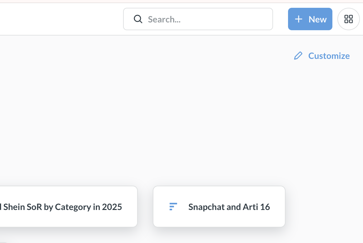
When you log in, you land on the home screen. To build your own chart, click the blue + New button at the top right.
-
2
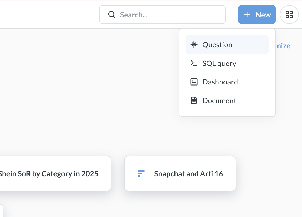
Choose “Question”
From the menu, pick Question, the point-and-click chart builder. (Use SQL query only if you want to write SQL yourself.)
-
3
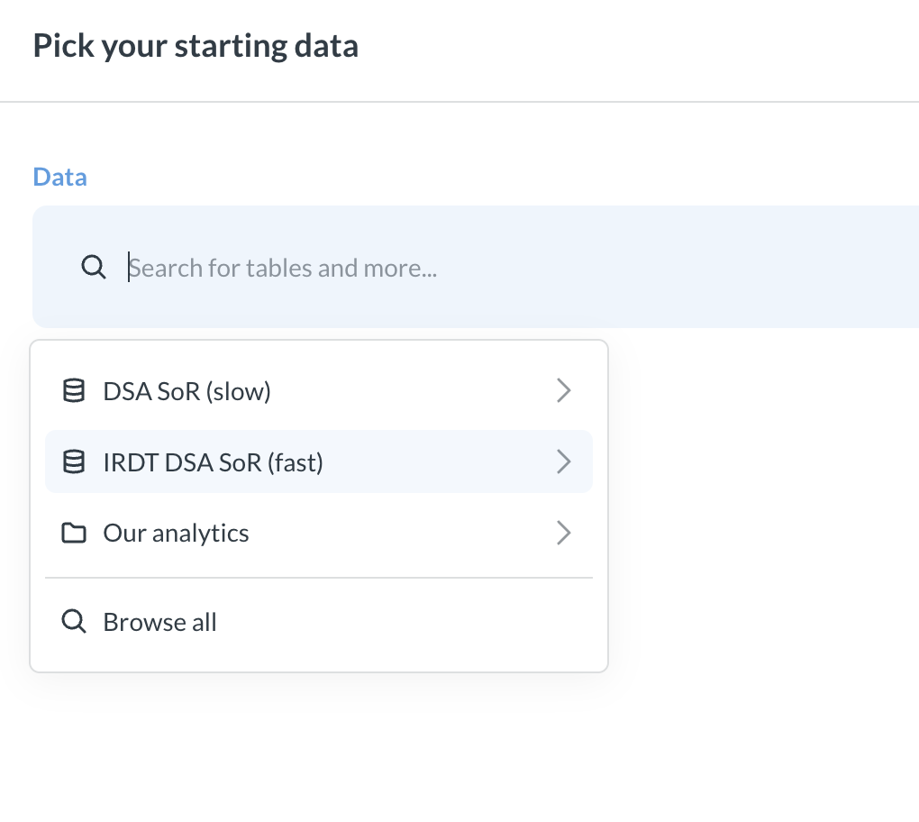
Pick your data source
Choose IRDT DSA SoR (fast), the pre-aggregated dataset built for speed, so charts load in seconds. (DSA SoR (slow) is the full row-level data; you rarely need it.)
-
4
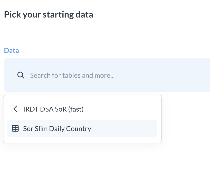
Pick the table
Choose Sor Slim Daily Country: one row per day, country, platform and category.
-
5
Meet the query builder
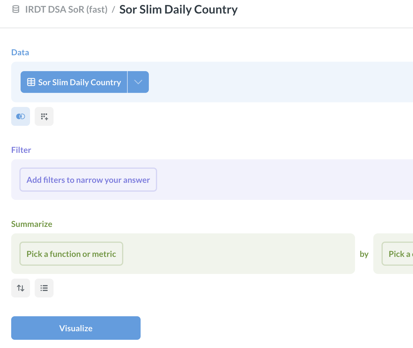
The builder has three parts, top to bottom: Data (already set), Filter (narrow which rows you want), and Summarize (the calculation).
-
6
Summarize: “Sum of …”
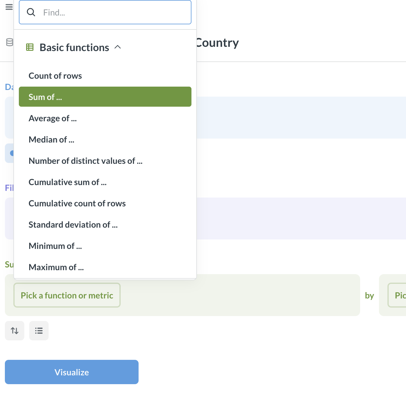
Under Summarize, click Pick a function or metric and choose Sum of ….
-
7
Sum the SoR count
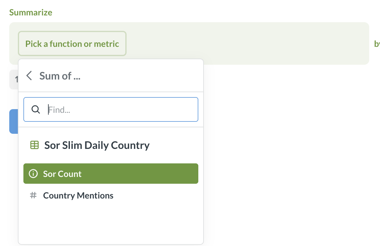
Choose Sor Count, the number of Statements of Reason. (Country Mentions counts each country a decision names; the data dictionary explains the difference.)
-
8
Group by a column, then Visualize
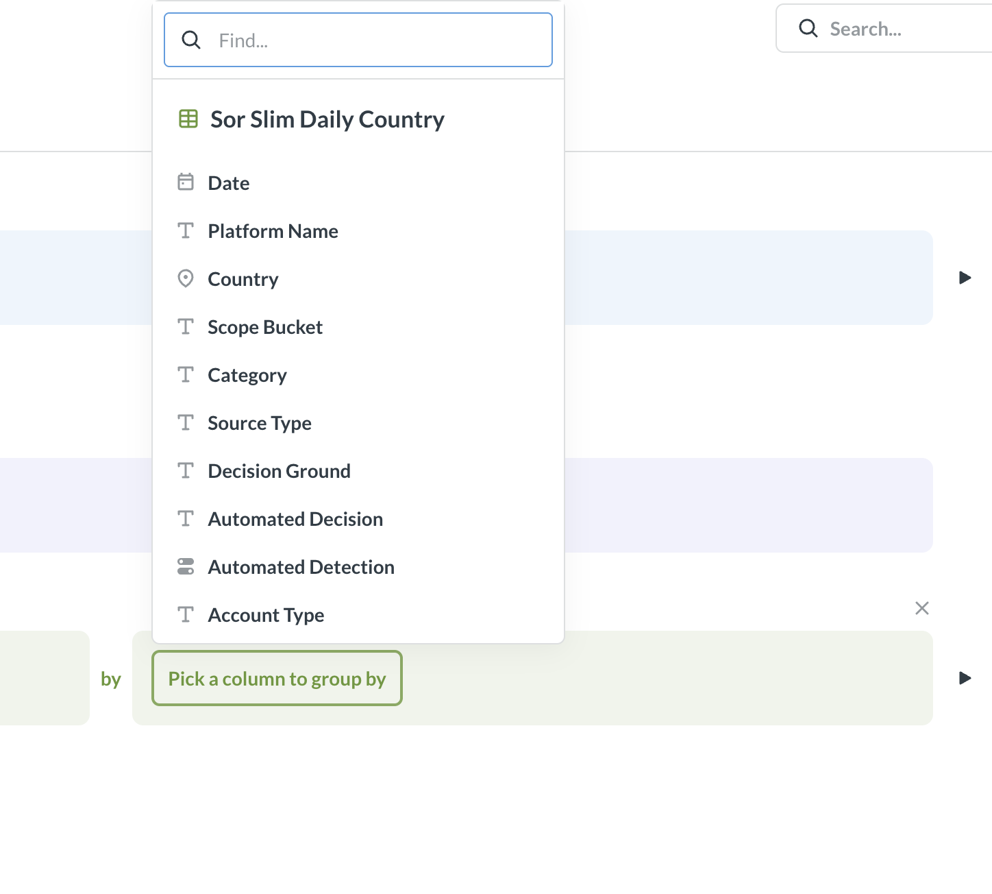
After by, pick how to break the total down, for example Date, Platform Name, Country, or Category, then click the blue Visualize button to see your chart.
That’s it. You’ve built Sum of SoR count, grouped by your chosen column. Swap the group-by column or add a Filter to explore further. Not sure what a column means? See the data dictionary.